Conscious design for better living.
Well-being begins in the place you live.
What this is (and how to put it to work)
This approach looks at how light, color, materials, sound, greenery, temperature, layout, and signage shape the brain—and with it our emotions, attention, memory, and decisions. It’s not a decor fad; it’s a way to design with intent and measure impact.
Here’s the no-fluff game plan:
- Set one clear goal (more focus, less stress, easier orientation).
- Tweak a few levers at a time (acoustics, light, color, wayfinding).
- Measure before and after with 2–3 simple indicators (satisfaction, errors, time-on-task).
Quick win: Pick one space you use daily. Write down the top 3 annoyances (noise, glare, getting lost). You just defined your first brief.
Offices: dial up focus without killing collaboration
Workstations that actually invite deep work
- Focus zones: mark them with subtle material/color shifts (light woods, warm textiles) and clear social signals (a small desk light = “heads down”).
- Layer your lighting: soft ambient glow plus a task lamp; nudge color temperature to fit the task (a touch cooler for analysis, warmer for ideation).
- Privacy where it counts: sound-absorbing panels near printers and chat hubs; rugs or resilient flooring along corridors to tame echo.
High-ROI micro moves
- Anchor desks with a view (or quality nature art if windows are scarce), a properly adjusted chair, and real lumbar support.
- Cognitive wayfinding: theme names (“Forest,” “River”) with consistent icons to cut mental load.
- Weekly pulse check: three questions—noise, light, temperature—to spot hotspots fast.
Try this today: Add felt pads to chair legs, place a medium-pile rug under the loudest path, and give each desk a warm task lamp. Cheap, fast, noticeable.
Classrooms: attention, memory, and well-being
Acoustics and teacher intelligibility
Start with the ceiling (acoustic clouds/panels), treat one wall with cork or felt, and break up parallel surfaces with soft furnishings. Less echo = clearer speech, less fatigue.
Color, stimuli, and signage
Keep big surfaces in soft palettes; use accent color only where you want attention (front wall, reading nooks). Too many posters/colors/textures = working-memory traffic jam.
Signage should be plain-English, icon-first, and arrow-consistent for restrooms, exits, library, and admin.
Layout and movement
Mobile islands for group work and calm corners with cocoon-style chairs or small screens let students dial their social exposure without being singled out.
Teacher CTA: Do a 10-minute “clap test” for echo, note trouble spots, then pilot ceiling tiles or a fabric wall strip on the noisiest side for two weeks.
Clinics and hospitals: lower anxiety from the doorstep
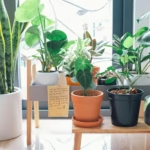
Biophilia and materials that soothe
Entrances with real greenery (or well-executed nature graphics), wood at reception, and breathing points (benches, warm indirect light) change how waiting feels. In exam rooms, textured textiles and nature scenes help down-shift arousal.
Legible routes
Keep paths short and obvious. Use color lines by destination (“follow the blue line to Lab”) and plain-English names, not internal acronyms. Add visual landmarks (a mural, a distinctive pendant) so people navigate without thinking.
Privacy and control
Heavier curtains, soft-close doors, and reachable light controls boost perceived privacy and prevent startle-inducing sounds.
Clinic CTA: Walk the most common patient journey and count decisions. If it’s over three before the first desk, simplify the route or add a landmark.
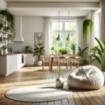
Homes: rest and real recovery
A bedroom that actually helps you sleep
Control darkness, keep temperature steady, and use warm, dimmable lights. Blackout curtains plus a directional reading lamp often beat a full furniture overhaul. Fewer screens/glare sources help your body wind down.
Kitchen and everyday social life
Light work surfaces well (direct beams without glare), offer both standing and seated spots, and aim for clear sightlines to the outdoors when you can. Warm-touch materials on pulls and secondary counters add tactile comfort.
Living room that balances energy
Layer textiles (rugs, throws) to soften noise, scatter light sources (floor and table lamps), and carve cozy nooks by a window or bookcase for reading.
Home CTA: Tonight, set a “wind-down” lamp to turn on at the same time. That tiny ritual cues your brain it’s time to shift gears.
Cross-cutting moves that don’t need a big budget
Lighting with a plan
- Morning: brighter and slightly cooler to get rolling.
- Evening: lower and warmer to ease off.
- Rule of thumb: light walls, not eyes.
Quick acoustics without construction
Bookshelves, dense curtains, peel-and-stick panels at first reflection points, medium-pile rugs, and chair-leg pads. Use a phone app just for comparison (baseline vs. after).
Color and contrast that guide
Add contrast to doors, baseboards, and handrails; keep big fields neutral; use accents with a job (point, calm, activate).
Signage that lowers mental load
Universal icons, consistent arrows, non-condensed typefaces, and no more than three choices per segment of a route.
CTA: Make a one-page cheat sheet: “Noise / Light / Wayfinding.” Each month, pick one lever and log a before/after note.
How to measure impact (no lab coat needed)
- Two-week baseline: a 3-question survey (1–5) on noise, light, temperature + one operational metric (task time, errors, wait lines).
- Implement 2–3 micro-interventions prioritized by impact vs. cost.
- Track for 2–4 weeks with the same measures.
- Tell the story with one simple chart and two comparison photos—beats a 20-page report.
CTA: Set a calendar reminder 30 days out: “Review changes, keep what works, kill what doesn’t.”
Common pitfalls (and how to dodge them)
- Going straight to looks without a behavioral goal.
- Stimulus overload: textures, colors, and signage all shouting at once.
- Ignoring sound: the stealth killer of focus and privacy.
- Skipping measurement: if you never set a baseline, “feels better” won’t stick.
30-day project template (on a budget)
Week 1 — Scan the space
Photos, a quick sketch, a 3-question survey, and basic readings for noise/light.
Week 2 — Keystone moves
Pick three: acoustic panels at hot spots, warm dimmable lamps, curtains, hardy plants, minimal consistent signage.
Week 3 — Fine-tuning
Rearrange furniture to break parallel surfaces, add soft finishes, and adjust color temperatures by task.
Week 4 — Measure & share
Repeat the survey, compare indicators, and present a clean one-pager with wins and next steps.
CTA: Snap “before” pics now. In four weeks, take “after” pics and jot three lines on what changed. That’s your proof—and your case for phase two.
FAQs
Do I need a big budget?
Nope. Start with noise, light, and signage using modular fixes. You’ll see—and measure—meaningful changes fast.
Does this help if I work from home?
Absolutely. Light the walls, add a task lamp, tame glare, and layer textiles (curtains, rugs). Better calls, better reading, better wind-down.
What if I don’t have windows?
Use indirect light, high-quality nature scenes, and warm materials. It won’t replace daylight, but comfort jumps noticeably.
How do I make the ROI case?
Tie one metric to your goal (errors, time, satisfaction) and show a clean before/after. With evidence, it’s easier to green-light the next round.
Closing
Designing for the brain means less friction, better focus when it matters, and calm when you need it. Pick a goal, make a couple of smart tweaks, and track the change—you’ll feel the difference in how people work, learn, heal, and rest.
Final CTA: Ready to level up one room? Drop three photos and your top three pain points. I’ll help you prioritize the next five moves that deliver the most bang for your buck.